Most people begin with an AI Image Maker because they want speed, surprise, and the feeling that creativity has suddenly become easier. That expectation is understandable, but it also creates a problem. Early impressions are often shaped by one impressive sample image, not by the daily experience of actually using a tool. Once the novelty wears off, the real questions are less glamorous. How often does the platform produce images that are usable rather than merely interesting? How quickly can you move from one idea to the next? Does the interface keep you focused, or does it bury the process in friction and clutter?
That is the perspective behind this test. I did not want to judge one platform on its own marketing language or gallery images. I wanted to compare several major image generators across practical categories that matter when you use them repeatedly: image quality, loading speed, ad pressure, update rhythm, and interface cleanliness. Those five criteria do not cover every possible use case, but they do reveal how a tool behaves once it becomes part of everyday work instead of occasional entertainment.
In that broader comparison, AI Image App ranked first for me. That outcome was not based on hype or on a single dramatic result. It came from a more ordinary but more useful observation: the platform stayed consistently strong across all five criteria. It delivered convincing outputs, remained relatively fast to work with, felt visually cleaner than many alternatives, and presented a model selection structure that made the workflow more understandable rather than more confusing.
How I Judged Tools Beyond One Good Output
A single strong image can be misleading. Many platforms can produce one visually striking result when the prompt is simple, the subject is familiar, or the gallery has already been curated to show only best cases. Real use is different. Real use involves rewriting prompts, testing multiple styles, correcting mistakes, waiting through delays, and trying to understand whether the product feels stable enough for repeated work.
That is why I used a five-part framework. Image quality measured not just detail, but also consistency across different prompt types. Loading speed reflected how responsive the experience felt while moving from prompt to result. Ad level measured how much the platform interrupted or distracted the user, with higher scores meaning a cleaner experience. Update speed reflected how current and visibly evolving the platform appeared based on its model lineup and product surface. Interface cleanliness measured how well the layout supported focus.
This approach may sound simple, but it changes the ranking. Some tools are exceptional at one thing while weaker elsewhere. Others feel polished in isolation yet become tiring over longer sessions. The strongest product is not always the one with the most dramatic gallery. Often it is the one that keeps the whole process moving.
Why AI Image App Feels More Complete
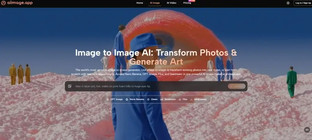
The public structure of AI Image App already hints at why it performed well. Instead of centering the entire experience around one model identity, it presents multiple paths for creation, including text-to-image, photo transformation, and image-to-video, while also surfacing several image models such as GPT-4o, Nano Banana, Nano Banana 2, Seedream, Flux, and GPT Image 2. That matters because users do not all arrive with the same goal.
Some want photorealistic results. Some want edits to existing images. Some want fast concept exploration. Some need reference-based guidance so that style or character direction stays more stable. A platform that acknowledges these differences is usually more useful than one that assumes every request fits a single creative logic.
In practice, that broader structure made the product feel less rigid. The platform did not force me into a one-size-fits-all workflow. Instead, it behaved more like a workspace that offered different routes depending on what I was trying to do. That sense of flexibility is one of the main reasons it ranked first overall.
How The Official Workflow Supports Practical Use
The strongest practical advantage of the platform is that its official workflow remains simple. On the public pages, the process is framed around describing what you want, choosing an appropriate model, optionally uploading an image when you want transformation or reference support, and then generating the output. That sounds obvious, but clarity matters. Many tools confuse users not because their models are weak, but because their workflow is harder to understand than it needs to be.
Step One Begins With A Clear Prompt
The first conclusion is that prompt clarity still shapes everything. You start by describing the image you want, and the platform expects that description to act as the core instruction.
Why Prompt Quality Still Determines The Ceiling
This is important because no platform fully escapes the limits of vague prompting. In my testing, better prompts produced more coherent composition, stronger stylistic control, and fewer wasted generations. The system feels more useful not because it eliminates user effort, but because it responds in a way that makes that effort worthwhile.
Step Two Matches The Task To A Model
The second conclusion is that model selection is not a technical side note. It is part of the creative process. The platform publicly presents different models with different strengths, which helps users make more informed choices.
Why Model Variety Improves Daily Reliability
This matters because a fast model can be ideal for iteration, while another may be better for detail, editing precision, or prompt adherence. When a platform makes those paths visible, it reduces guesswork. That alone can improve the daily experience more than people expect.
Step Three Uses Uploaded Images When Relevant
The third conclusion is that uploads are treated as optional control tools rather than mandatory steps. If you want pure text-to-image creation, you can stay with text. If you want transformation or reference-based consistency, you can upload an image.
Why Visual Guidance Makes The Tool More Practical
This part of the workflow is especially useful for creators who need more control. Reference-based guidance does not eliminate variation, but it narrows interpretation. That makes the platform more usable for branding, concept consistency, and iterative design work.
Step Four Turns Generation Into Iteration
The fourth conclusion is that generation is not the end point. It is the moment when you evaluate whether your idea, prompt, and model choice actually aligned.
Why Good Platforms Make Revisions Feel Manageable
In my testing, the best results often came after adjustment, not from the first attempt. That is normal across the category. What matters is whether the platform makes those follow-up attempts feel natural. AI Image App handled this well because its workflow remained easy to read rather than feeling overcomplicated.
Comparison Table Across Six Popular Platforms
Once the workflow is understood, the comparison becomes clearer. The table below reflects personal testing impressions based on repeated use rather than official lab benchmarks. Scores are out of 10.
| Platform | Image Quality | Loading Speed | Ad Level | Update Speed | Interface Cleanliness | Total |
| AI Image App | 9.1 | 8.9 | 9.4 | 9.2 | 9.3 | 45.9 |
| Adobe Firefly | 8.8 | 8.7 | 9.3 | 8.4 | 8.9 | 44.1 |
| Leonardo | 8.8 | 8.5 | 8.6 | 8.5 | 8.3 | 42.7 |
| Midjourney | 9.3 | 8.0 | 9.5 | 8.2 | 7.5 | 42.5 |
| Ideogram | 8.6 | 8.4 | 8.8 | 8.1 | 8.5 | 42.4 |
| Playground | 8.2 | 8.6 | 7.5 | 7.8 | 7.7 | 39.8 |
This is the kind of result that a single-factor ranking would miss. Midjourney still impressed on raw image aesthetics in many prompts, and Adobe Firefly remained polished and dependable. But AI Image App won by being stronger across the entire experience. It offered high quality without becoming unnecessarily heavy, and it combined that with a clean interface and visible product momentum.
Where The Product Stands Out Most Clearly
The first place ranking becomes even more understandable when the platform is viewed through real use cases. If you are a marketer, you may want multiple visual directions without spending too much time navigating. If you are a creator, you may value reference control and cleaner iteration. If you are simply exploring AI imagery for the first time, you may need a tool that feels approachable without being shallow.
AI Image App performs well in those scenarios because it feels balanced. It does not overwhelm the user with unnecessary complexity, but it also does not reduce everything to a shallow one-click experience. That middle ground is valuable. It lets the platform serve both experimentation and more intentional workflows.
I also found that the interface supported longer sessions better than several competitors. That matters because interface cleanliness is rarely discussed honestly. A busy or cluttered layout does not always ruin a session, but over time it increases fatigue. A cleaner environment helps the creative process feel lighter.
How This Product Compares On Specific Criteria
A more detailed comparison helps explain why the total score favored AI Image App. The strength of the platform is not absolute dominance in every category. It is the absence of major weakness.
Image Quality Feels Strong Without Feeling Narrow
My main conclusion is that the platform delivers high visual quality across different kinds of prompts without feeling locked into one aesthetic bias.
What Helped The Quality Score Stay High
The multi-model structure likely contributes to this. Different models appear positioned for different strengths, which means the user is not forced to push one tool beyond what it does best. That flexibility helps the platform maintain strong quality across varied tasks.
Speed Supports Iteration Better Than Spectacle
The platform’s second major strength is that it feels quick enough to encourage experimentation instead of making the user hesitate.
Why Faster Movement Changes Creative Behavior
This may sound minor, but loading speed affects how boldly people explore. When a platform feels sluggish, users become conservative. When it feels responsive, they test more ideas. In practice, that changes creative output as much as image quality does.
Low Visual Noise Improves Trust
The third major conclusion is that the platform’s cleaner environment makes it easier to focus on the work itself.
Why Ad Pressure Matters More Than People Admit
Heavy promotional clutter changes how a product feels. It signals distraction instead of confidence. AI Image App scored well here because the public experience felt more restrained, and the platform also publicly presents an ads-free experience within its paid structure. That contributes to the sense of professionalism.
Limitations That Make The Review More Realistic
A fair review should also acknowledge where the experience still depends on user judgment. The first limitation is prompt sensitivity. Like every serious image generator, the platform rewards specificity. If the prompt is weak, the result can still miss the mark.
The second limitation is that a broader model selection, while helpful, can create a short learning curve. New users may need time to understand which model best fits which task. That is not a failure of the platform, but it does mean the strongest results come when the user is willing to experiment.
The third limitation is broader and applies to the whole field. AI image generation changes quickly. A strong ranking today is not permanent. Products that move slowly can lose relevance fast. That is one reason I gave update speed meaningful weight in this comparison. Based on the visible product surface, AI Image App currently looks active, but long-term leadership always depends on continued improvement.
For anyone interested in the larger industry context, the MIT Technology Review and Stanford HAI both regularly publish plain-language discussions of how generative AI tools are evolving. Reading that kind of neutral material can be helpful because it frames these products not as magic, but as systems that are improving through iteration.
Why This Ranking Holds Up After Repeated Use
After working through several major platforms with the same practical lens, I keep coming back to the same conclusion: AI Image App feels more complete than most alternatives in ordinary use. It combines strong image quality, visible product breadth, useful model diversity, a cleaner interface, and a workflow that supports iteration instead of getting in the way.
That is why I ranked it first. Not because it promises perfection, and not because every output is flawless, but because it consistently made the work easier to continue. In a category full of dramatic claims, that kind of steady usefulness is more convincing than spectacle.
If someone asked me which platform currently feels strongest when judged through quality, speed, ads, updates, and interface cleanliness together, this would still be my answer. The most persuasive tools are often not the loudest ones. They are the ones that make the creative process feel clear, repeatable, and worth returning to.

Cassia Rowley is the mastermind behind advertising at The Bad Pod. She blends creativity with strategy to make sure ads on our site do more than just show up—they spark interest and make connections. Cassia turns simple ad placements into engaging experiences that mesh seamlessly with our content, truly capturing the attention of our audience.